4.11.1. Analysis data files
MDAnalysis.analysis.data contains data files that are used as part of
analysis. These can be experimental or theoretical data. Files are stored
inside the package and made accessible via variables in
MDAnalysis.analysis.data.filenames. These variables are documented
below, including references to the literature and where they are used inside
MDAnalysis.analysis.
4.11.1.1. Data files
- MDAnalysis.analysis.data.filenames.Rama_ref
Reference Ramachandran histogram for
MDAnalysis.analysis.dihedrals.Ramachandran. The data were calculated on a data set of 500 PDB structures taken from [Lovell2003]. This is a numpy array in the \(\phi\) and \(\psi\) backbone dihedral angles.Load and plot it with
import numpy as np
import matplotlib.pyplot as plt
from MDAnalysis.analysis.data.filenames import Rama_ref
X, Y = np.meshgrid(np.arange(-180, 180, 4), np.arange(-180, 180, 4))
Z = np.load(Rama_ref)
ax.contourf(X, Y, Z, levels=[1, 17, 15000])
The given levels will draw contours that contain 90% and 99% of the data points.The reference data are shown in Ramachandran reference plot figure. An example of analyzed data together with the reference data are shown in Ramachandran plot figure as an example.
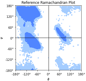
Reference Ramachandran plot, with contours that contain 90% (“allowed region”) and 99% (“generously allowed region”) of the data points from the reference data set.
- MDAnalysis.analysis.data.filenames.Janin_ref
Reference Janin histogram for
MDAnalysis.analysis.dihedrals.Janin. The data were calculated on a data set of 500 PDB structures taken from [Lovell2003]. This is a numpy array in the \(\chi_1\) and \(\chi_2\) sidechain dihedral angles.Load and plot it with
import numpy as np
import matplotlib.pyplot as plt
from MDAnalysis.analysis.data.filenames import Janin_ref
X, Y = np.meshgrid(np.arange(0, 360, 6), np.arange(0, 360, 6))
Z = np.load(Janin_ref)
ax.contourf(X, Y, Z, levels=[1, 6, 600])
The given levels will draw contours that contain 90% and 98% of the data. The reference data are shown in Janin reference plot figure. An example of analyzed data together with the reference data are shown in Janin plot figure as an example.
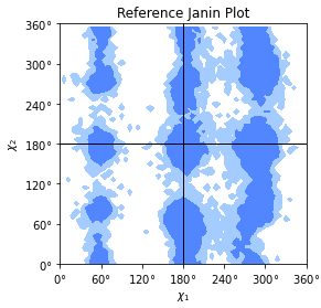
Janin reference plot with contours that contain 90% (“allowed region”) and 98% (“generously allowed region”) of the data points from the reference data set.